The “Why” Behind Our Brand Refresh
A little detail goes a long way
Some changes happen all at once, others happen quietly over time. There was a small nagging feeling that something wasn't quite right, and I finally had the chance to fix it.
When I launched Emma Morgan Creative in late 2021 I focused on the momentum of my expertise and network versus long-term planning. I quickly picked a name, developed a logo and put together a website so I could hit the ground running. I figured I could figure out the spirit and logistics of the brand after I launched. Fortunately, I was mostly right, but I wanted to revisit the framework and aesthetic I hastily put together.
Late last year, I could see I would have some time between projects and wanted to finally revisit who Emma Morgan Creative has become, and wants to be in the future. That time of discovery and reflection gave me the space to finally tackle some of the things that always felt rushed, not final, and unbalanced to me about the brand.
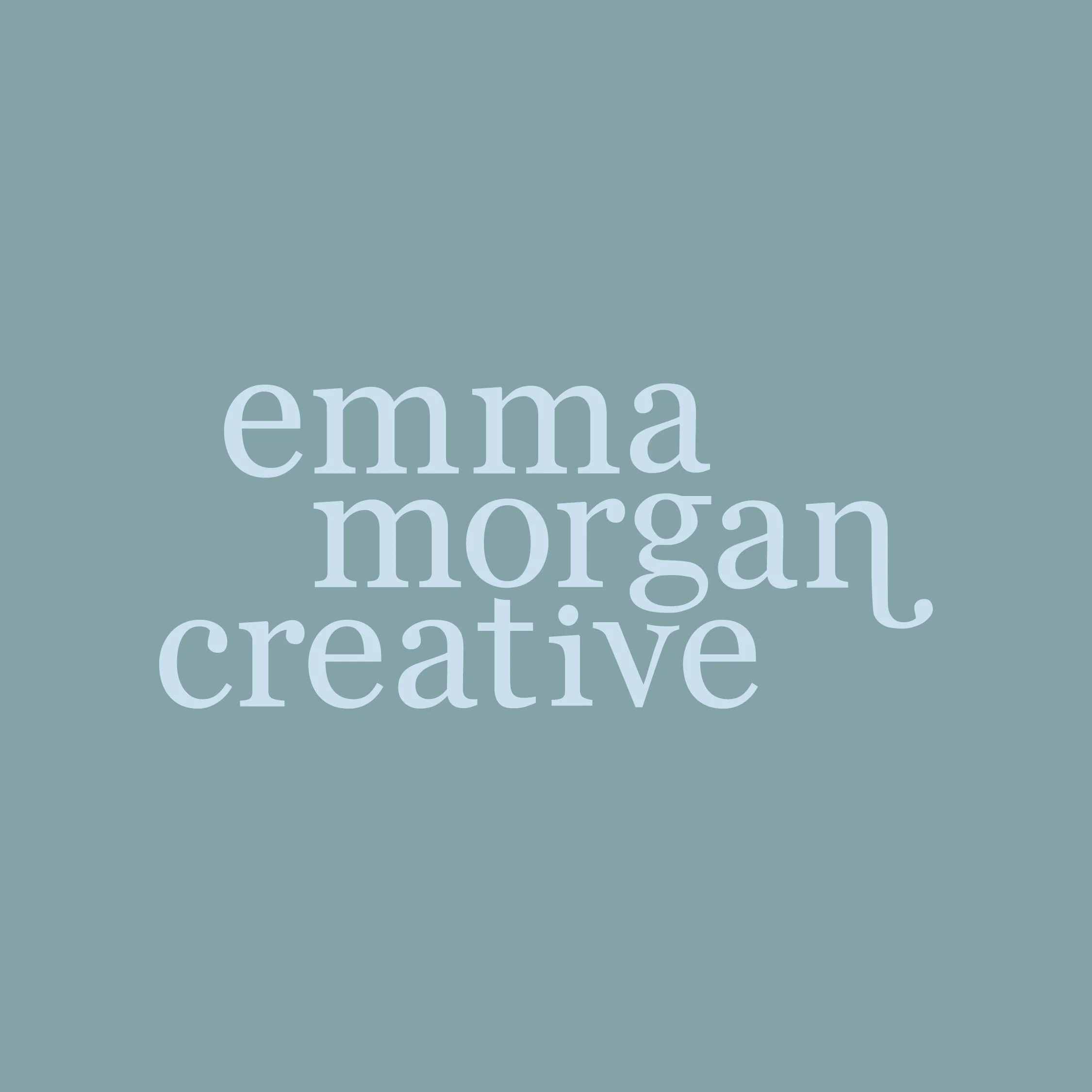
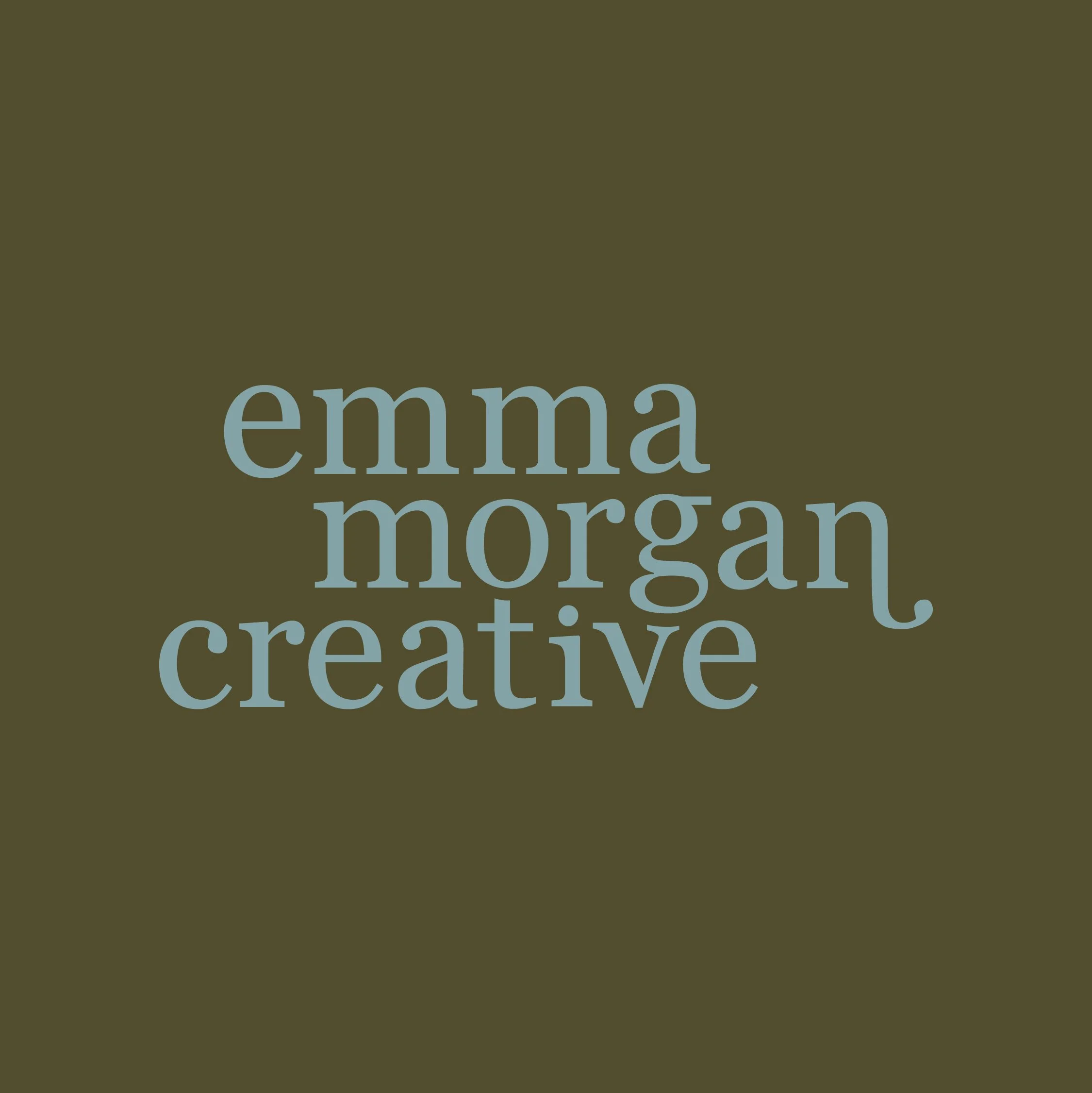
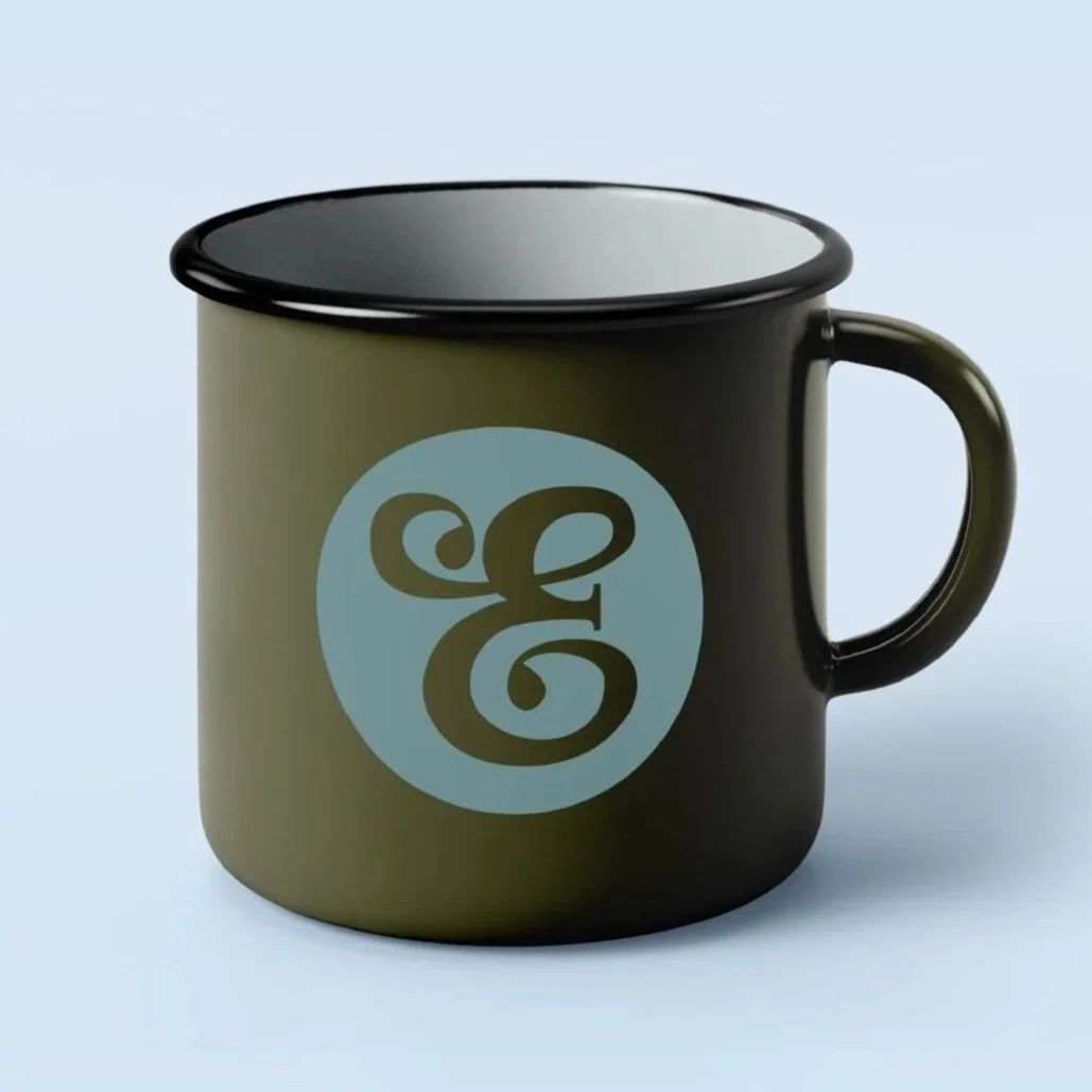
It started with the logo.
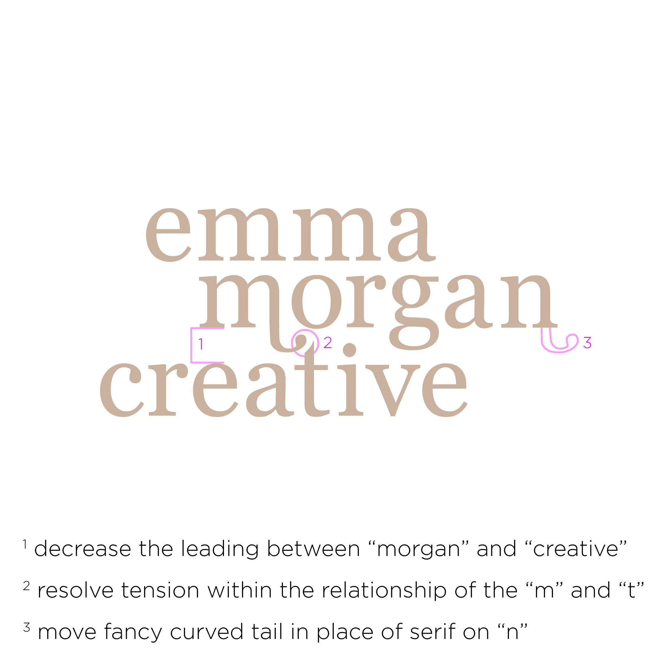
I am detail-oriented, sometimes to a fault…which means something feeling slightly off about the logo was impossible to ignore. It was a small bother, but persistent – I felt the legibility, balance, and slight visual hierarchy were off. I welcomed the opportunity to get it right. By tweaking the leading and resolving unwanted tension—like moving the curved tail from the 'm' to the 'n'—that persistent 'off' feeling finally evaporated. It’s a minute change, but it brought a sense of structural peace that was missing.
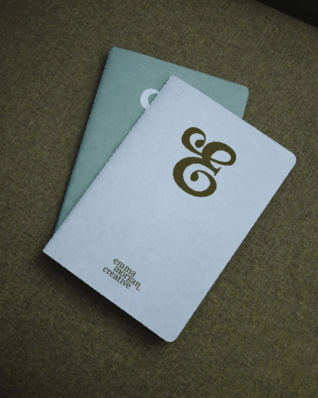
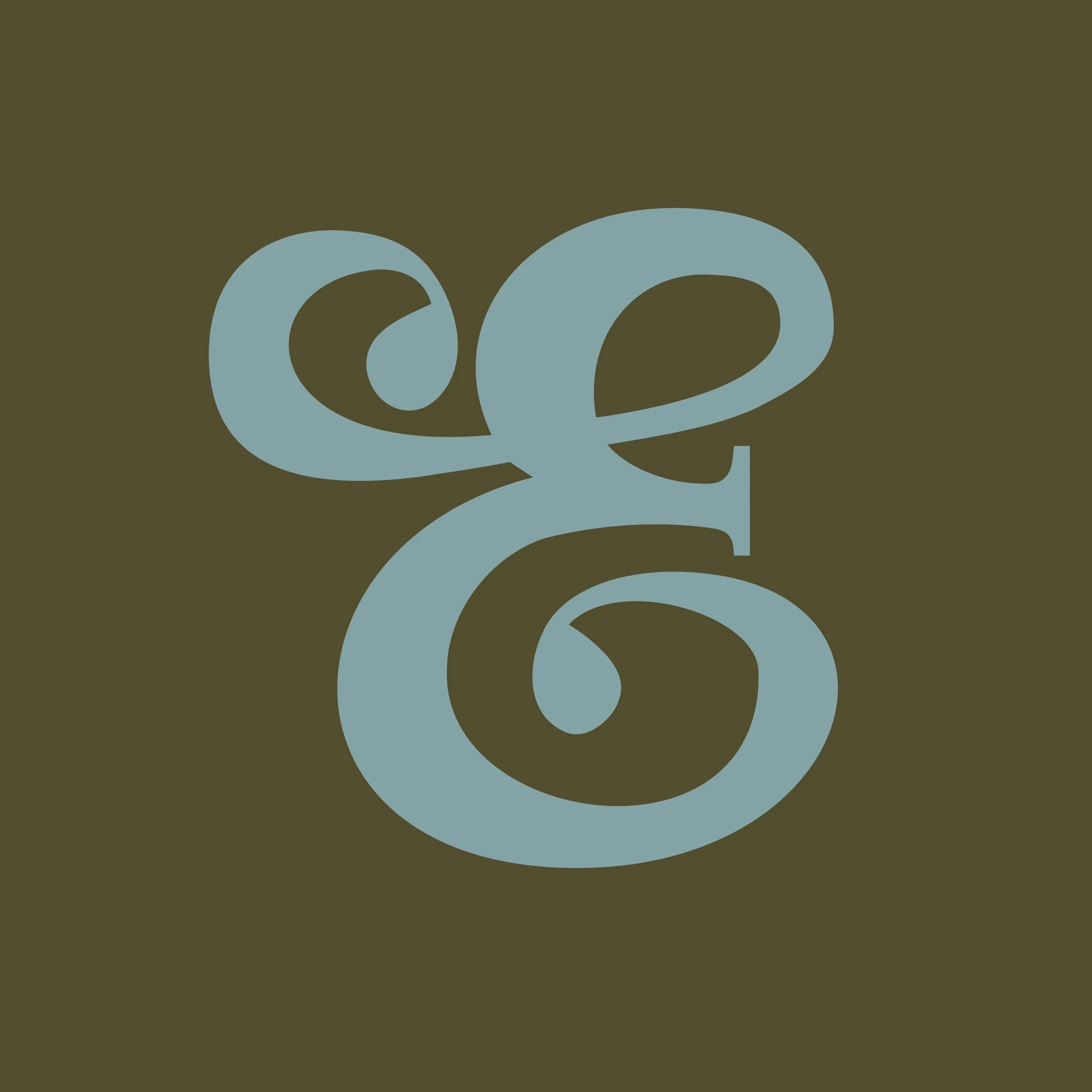
I also added something I’ve always wanted as part of my brand – an oversized letter based icon to complement the main logo. Designed to add personality, joy, and warmth to our visual language, it was inspired by a script "E" necklace I had growing up. It had a nostalgic quality but I freshened it up by a customized serif detail on the middle arm of the E and semi-imperfect teardrop terminals to tie it back to our modified Georgia font, a small touch that makes it feel intentional and uniquely ours.

Then came color.
My previous palette was doing its job – it looked professional and showed the work – but it didn't show me. It felt a little generic, a little cold, and not quite reflective of the warmth and personality I bring to every project.
The new palette changed all of that. Neutral olive greens, a warm-toned ocean blue, and crisp sky blue – colors I am genuinely and consistently drawn to in clothing, interiors, and nature – making them colors that feel personal. They are softer, warmer, grounded, and more approachable, which is exactly the feeling I wanted to create.

And underneath it all, a shift in the services Emma Morgan Creative offers.
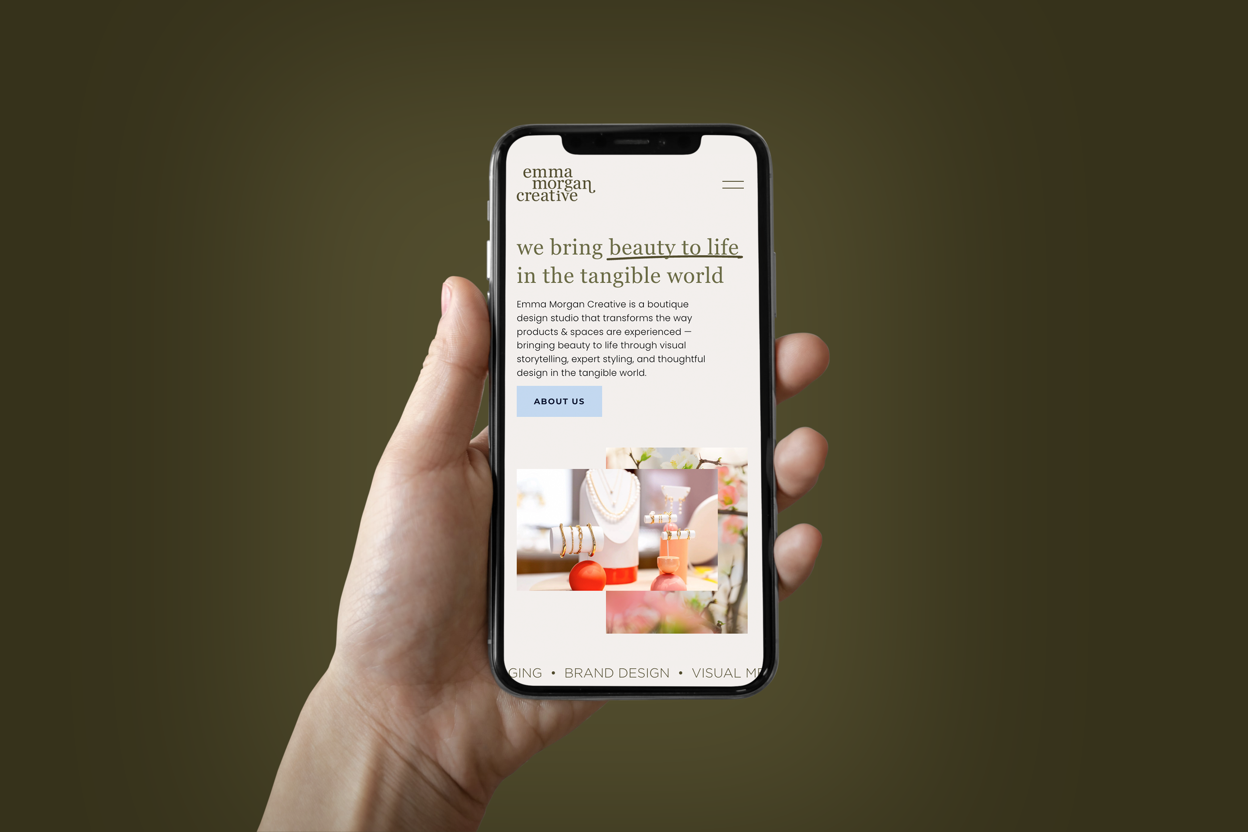
As I reflected on the past few years and what my future goals are, I worked to refine and focus Emma Morgan Creative’s offerings. I've organized my design services into three distinct, strategically connected pillars: Visual Merchandising, Styling & Home Staging, and Surface & Brand Design. It's a shift toward the work I find most rewarding – projects that require a physical expression and tangible experience – and now the brand reflects not just what I do, but who I am. I approach projects with calm confidence and like to think I am easy to work with: reliable, honest, and knowledgeable. Less fussy, more human. That’s the personality and voice I’d like my refreshed brand language and website to communicate.
The work has always been there. Now the brand (in my opinion) finally looks more like the person behind it.
I'd love for you to take a look around and if any of this resonates with you, whether you're a fellow creative with constructive feedback (or praise 😉), or a future client ready to transform how your products, spaces, or home shows up in the tangible world — let's talk.